Responsive Design for gallery websites
What is “responsive design?
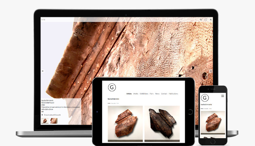
When we talk about “responsive” websites, we mean websites that automatically adapt themselves to any screen size – whether it’s a big desktop monitor or smaller smartphones and tablets. This means not only arranging the page to make it easy to read and browse on any device, but includes loading the right image for retina and other high-resolution displays.
Why is responsive design so important?
The number of users who view websites on mobile devices is steadily increasing. Already 40% of the gallery websites are viewed via smartphone or tablet – one third of your potential customers!
Responsive layouts mean that mobile visitors don’t have to scroll and zoom to use the site, making it easier for them to get the information they’re looking for. Mobile-optimized sites also mean better search engine rankings for users searching on mobile, which means more visitors.
The benefits to you
These techniques mean that your website will always look good and be easy to use, regardless of how your visitors are browsing it. ARTBUTLER websites takes care of mobile for you, so you never have to worry about seperate mobile pages or content – it’s all managed from one place.
ARTBUTLER Websites are optimized for your collector’s smartphones and tablets. This means your art looks stunning on every device! Find out more about your benefits of ARTBUTLER Websites.